Tidy Tuesday: Bird diversity
I can’t believe this is my first #TidyTuesday! If you haven’t tried it, I encourage you to check it out here and check out the hashtag on Twitter. This weeks dataset was a deceptively simple set of bird sightings in the Hamilton area of Ontario every Christmas since 1921. In my day job, I’ve been exploring the distribution of hotel bookings and the bird count data has a very similar structure so thought it would be a good time to play with a new distirbution metric - the gini index. On the way, I learnt a couple of new tricks in R:
str_wrapfor subtitles without explicit line breaksggforce::geom_mark_circlefor cool labels
I tweeted my submission here and code below:
Set up
library(tidyverse)
library(lubridate)
library(ggforce)

theme_set(theme_minimal())

# download the data
bird_counts <- readr::read_csv("https://raw.githubusercontent.com/rfordatascience/tidytuesday/master/data/2019/2019-06-18/bird_counts.csv",
                               col_types = cols(
  year = col_integer(),
  species = col_character(),
  species_latin = col_character(),
  how_many_counted = col_double(),
  total_hours = col_double(),
  how_many_counted_by_hour = col_double()
)
                               ) %>%

  # saw from the tidy tuesday post that data is only reliable post 1955
  filter(year >= 1955)
Function to calculate gini index for a year
get_gini <- function(.data) {

  .data %>%
    group_by(species) %>%
    summarise(how_many_counted = sum(how_many_counted)) %>%
    arrange(how_many_counted) %>%
    # used row number so we get a diffeent ranking for each species and there no ties
    mutate(rank_asc = row_number()) %>%
    mutate(egal_count = sum(how_many_counted) / n_distinct(species),
           egal_count = egal_count / sum(egal_count),
           egal_count = cumsum(egal_count),
           cum_count = how_many_counted / sum(how_many_counted),
           cum_count = cumsum(cum_count)) %>%
    select(rank_asc, ends_with("count")) %>%
    summarise(gini = sum(egal_count - cum_count) / max(rank_asc)) %>%
    pull(gini)

}
Gini index plot
First, I need to get the stats for number of species to use in labelling the plot and the data for the gini index
number_species <- bird_counts %>%
  filter(how_many_counted > 0) %>%
  group_by(year) %>%
  summarise(n = n_distinct(species))


bird_diversity <-
  bird_counts %>%
  group_by(year) %>%
  nest() %>%
  mutate(gini = map_dbl(data, ~ get_gini(.x))) %>%
  left_join(
    number_species,
    by = "year"
  )
OECD data on gini index
I use this for annotating the plot.
# https://data.oecd.org/inequality/income-inequality.htm
oecd_gini <- tibble(
  country = c("Chile", "Mexico", "Costa Rica"),
  year = c(2015, 2016, 2017),
  gini = c(0.45, 0.46, 0.48),
  x_axis = c(1955, 1956, 2015)
) %>%
  mutate(country = str_c(country, " ", year))
Actual plot
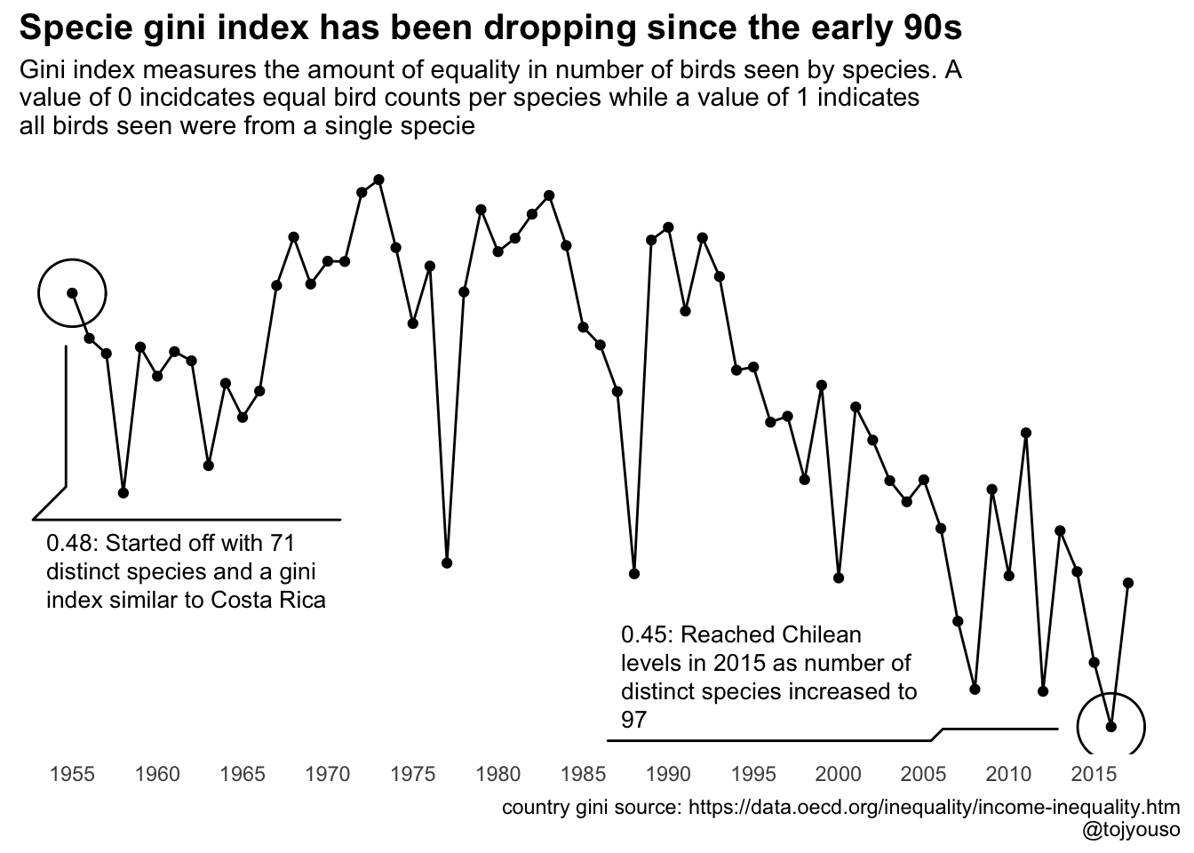
desc_1955 <- glue::glue("0.48: Started off with ",
                        {filter(number_species, year == 1955) %>% pull(n)},
                        " distinct species and a gini index similar to Costa Rica")

desc_2016 <- glue::glue("0.45: Reached Chilean levels in 2015 as number of distinct species increased to ",
                        {filter(number_species, year == 2016) %>% pull(n)})


bird_diversity %>%


  ggplot(aes(x = year, y = gini)) +
  geom_line() +
  geom_point() +
  labs(title = "Specie gini index has been dropping since the early 90s",
       subtitle = str_wrap("Gini index measures the amount of equality in number of birds seen by species. A value of 0 incidcates equal bird counts per species while a value of 1 indicates all birds seen were from a single specie"),
       # y = "gini index",
       y= NULL,
       x = NULL,
       caption = glue::glue("country gini source: https://data.oecd.org/inequality/income-inequality.htm
                            @tojyouso")) +
  theme(
    plot.title = element_text(size = 15,
                              face = "bold"),
    panel.grid = element_blank(),
    axis.text.y = element_blank()
  ) +
  scale_x_continuous(breaks = seq(1955, 2015, 5)) +

  # using ggforce::geom_mark_circle to mark the start and end points
  geom_mark_circle(aes(filter = year == 1955, description = desc_1955),
                   label.fontsize = c(0, 10)) +
  geom_mark_circle(aes(filter = year == 2016, description = desc_2016),
label.fontsize = c(0, 10)) 
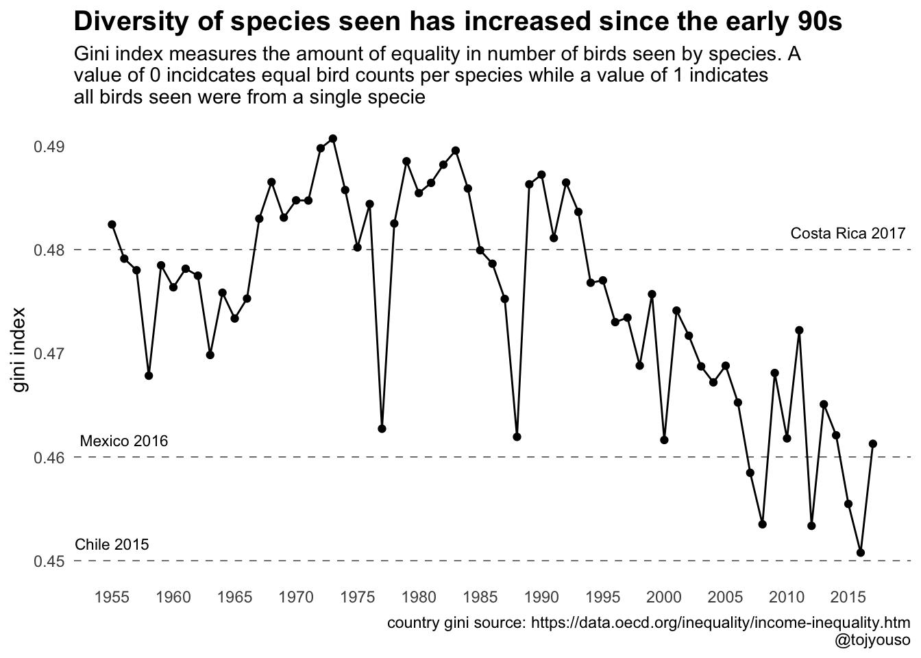
I also had an alternate version which I also like but I have a thing for plots with no y-axis so went with the first one.
bird_diversity %>%
  ggplot(aes(x = year, y = gini)) +
  geom_line() +
  geom_point() +
  labs(title = "Diversity of species seen has increased since the early 90s",
       subtitle = str_wrap("Gini index measures the amount of equality in number of birds seen by species. A value of 0 incidcates equal bird counts per species while a value of 1 indicates all birds seen were from a single specie"),
       y = "gini index",
       x = NULL,
       caption = glue::glue("country gini source: https://data.oecd.org/inequality/income-inequality.htm
                            @tojyouso")) +
  theme(
    plot.title = element_text(size = 15,
                              face = "bold"),
    panel.grid = element_blank()
  ) +
  scale_x_continuous(breaks = seq(1955, 2015, 5)) +
  geom_hline(aes(yintercept = gini), data = oecd_gini, linetype = "dashed",
             size = 0.2) +
  geom_text(aes(x = x_axis, y = gini ,label = country), vjust = -1,
data = oecd_gini, size = 3) 
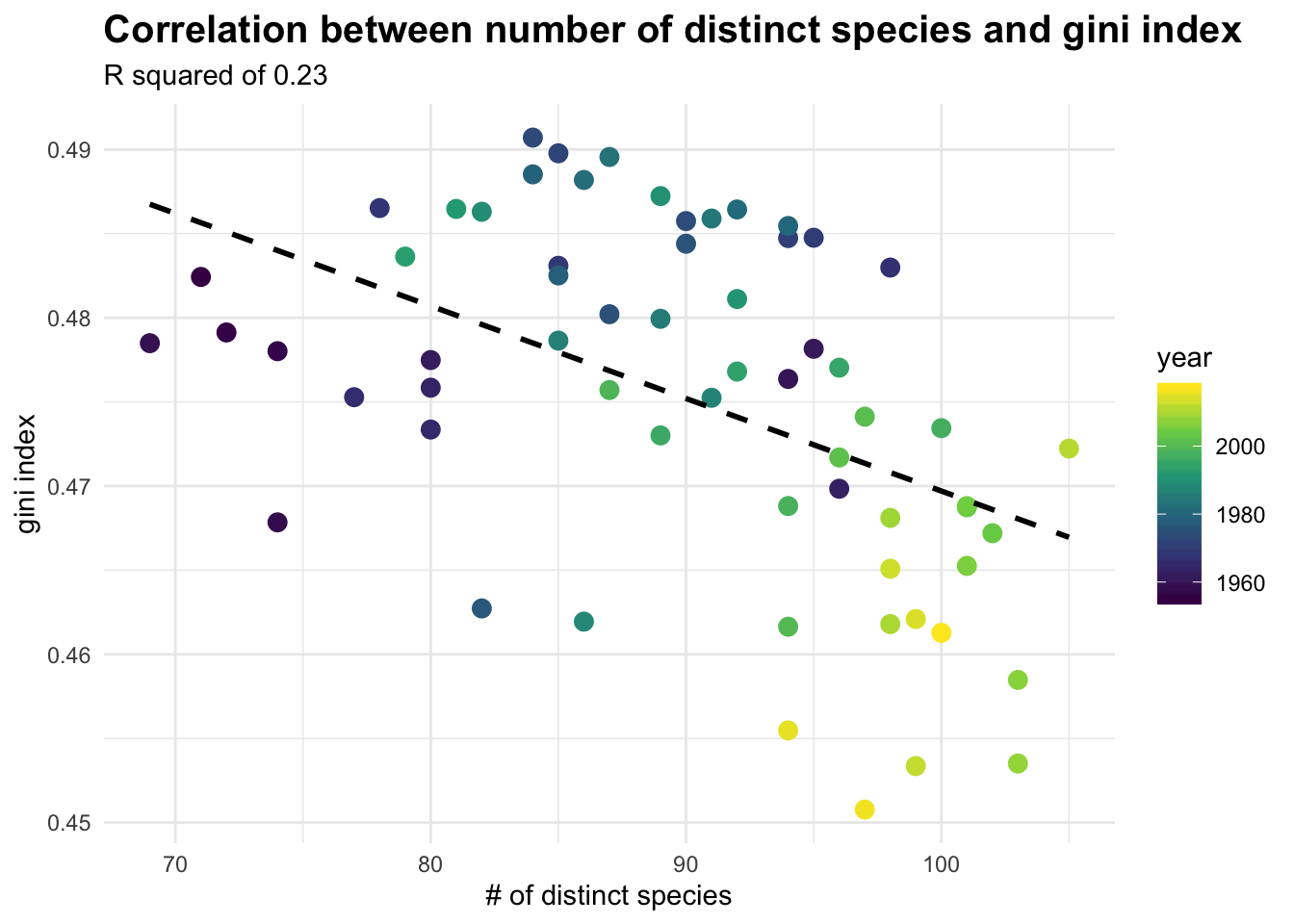
Lastly, I also wanted to check how much the increasing number of species explains the increased diversity:
rsq <- bird_diversity %>%
  lm(data =.,
     gini ~ n) %>%
  broom::glance() %>%
  pull(r.squared)
bird_diversity %>%
ggplot(aes(x = n, y = gini, colour = year)) +
geom_point(size = 3) +
geom_smooth(method = "lm", se = F, linetype = "dashed", colour = "black") +
labs(title = "Correlation between number of distinct species and gini index",
subtitle = str_c("R squared of ", round(rsq, 2)),
x = "# of distinct species",
y = "gini index") +
theme(
plot.title = element_text(size = 15,
face = "bold")
) +
scale_colour_viridis_c()
So to conclude, there seems to be a larger variety of species sighted every Christmas and it’s not just driven by the increase in the number of species. That sounds like positive news to me!
All in all, a very fun Saturday morning! Thanks to all who make this happen.