Sudan, the last male northern white rhino
I recently read a story on the guardian about the last male northern white rhino who died last week effectively rendering the species extinct. I had never heard of a northern white rhino so googled to see what it looked like and what kind of rhinos exist. So it turns out there are five main types of rhinos: white , black, Indian, Javan and Sumatran.1
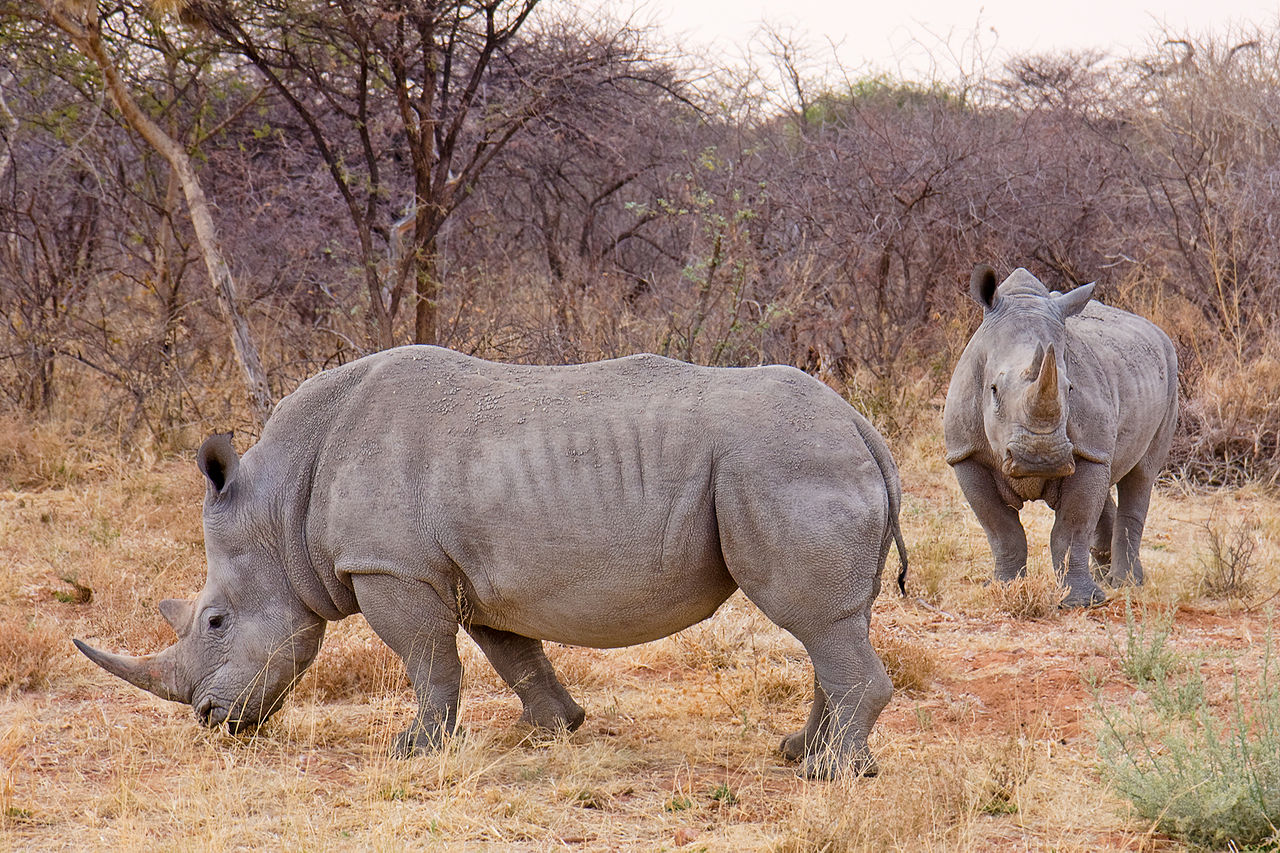
Here’s a picture of two:
And another one up close:
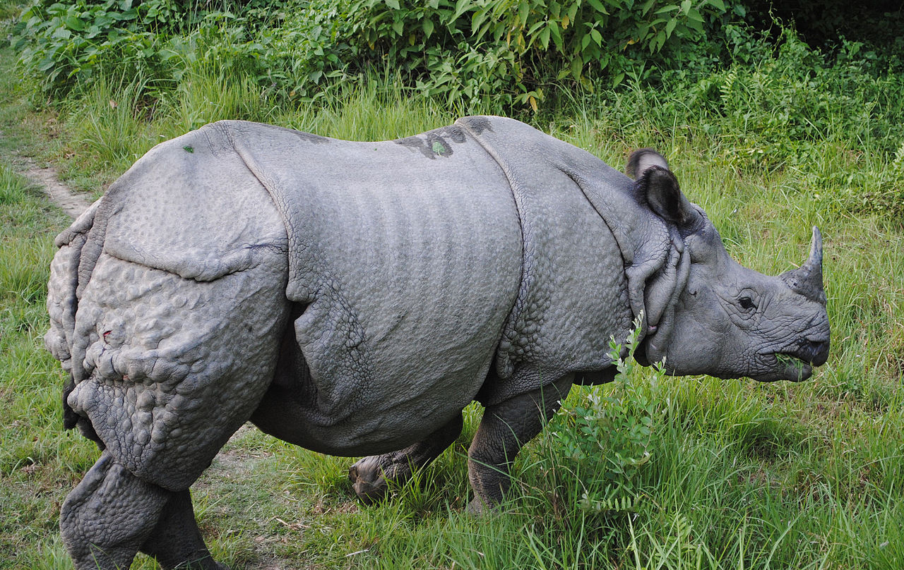
They are awesome animals aren’t they?
I was interested in this for a couple of reasons:
- It’s a sad story that I wanted to further highlight
- It’s one of my dreams to go on safari
- I think rhinos are incredible animals - their size, the thick grey hide and those majestic horns
- I want to highlight great things about Africa
- I thought writing this would give me a chance to practise some
Rskills
White rhinos
First of all, white has nothing to do with their colour as you can see above, they are actually grey like most rhinos. They are called white because early English South African speakers settling in Africa mistook the German word wijd meaning wide (as in wide mouthed rhino) for white. The wide mouth is the main difference between the white rhinos and the black rhinos.
White rhinos can be further subdivided into two subspecies: northern and southern. The northern is smaller, less hairy and has a smaller horn.2
With the new and excellent patchwork3 package by Thomas Lin Pedersen, I can create a bunch of ggplot2 charts together in one plot describing how I compare to a typical rhino. This functionality is not new but how easy to use and intuitive it is - that’s why I love it already. It’s as simple as adding to ggplots together!
# create rhino weight height data
rhino_man <- data_frame(animal = c("toju", "rhino"),
                        weight = c(100, 2000),
                        height = c(177, 190),
                        length = c(20, 400),
                        horns = c(0, 2))

ggplot(data = rhino_man, aes(x = animal, y = weight)) +
  geom_col(fill = "grey") +
  labs(x = NULL, y = "weight (kg)",
       title = "Rhinos are much heavier\nthan me") +
  theme(panel.grid = element_blank()) +
  # add new plot
  scale_y_continuous(breaks = 2000, labels = c(2000)) +
  ggplot(data = rhino_man, aes(x = animal, y = height)) +
  geom_col(fill = "grey") +
  labs(x = NULL, y = "height (cm)",
       title = "I'm almost the same height\nas a rhino") +
  theme(panel.grid = element_blank()) +
  scale_y_continuous(breaks = 190, labels = c(190)) +
  # add new plot
  ggplot(data = rhino_man, aes(x = animal, y = length)) +
  geom_col(fill = "grey") +
  labs(x = NULL, y = "length (cm)",
       title = "Rhinos are much longer\nthan me") +
  theme(panel.grid = element_blank()) +
  scale_y_continuous(breaks = 400, labels = c(400)) +
  # add new plot
  ggplot(data = rhino_man, aes(x = animal, y = horns)) +
  geom_col(fill = "grey") +
  labs(x = NULL, y = "# of horns",
       title = "Rhinos have a couple more\nhorns than I do") +
  theme(panel.grid = element_blank()) +
  scale_y_continuous(breaks = 2, labels = c(2)) +
  plot_layout(ncol = 2)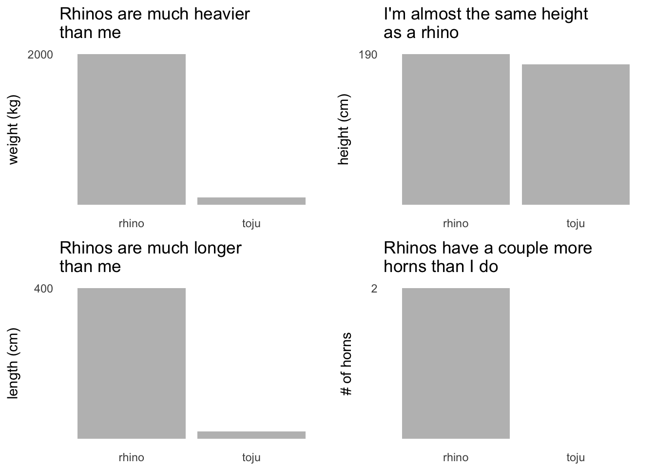
Sudan and the plight of the northern white rhino
As mentioned earlier, Sudan (the last male northern white rhino) died last week on the 19th of March 2018. Effectively making the subspecies extinct. He leaves two female rhinos - Najin, his daughter and Fatu his granddaughter who currently reside in Ol Pejeta Conservancy in Kenya. The population of rhinos has been drastically reduced due to heavy poacher activity while a few have been caught and kept in zoos and national parks.
To plot the data I first needed to scrape the Wikipedia site (using rvest). The code below will extract all html tables on the Wikipedia page into a list. The population table I want is the second table so I just need to extract that
url <- "https://en.wikipedia.org/wiki/Northern_white_rhinoceros"
rhinos <- url %>%
  read_html() %>%
  html_table()

rhinos <- rhinos[[2]]

head(rhinos[, 1:5])
## Location 1909[56] 1960* 1975* 1984
## 1 Wild 2,000–3,000* 2,000*[18] 500*[27] 15[40]
## 2 Central African Republic n/a n/a n/a 0
## 3 Dem. Republic of Congo n/a n/a n/a 15
## 4 South Sudan n/a n/a n/a 0
## 5 Uganda n/a n/a n/a 0
## 6 Captivity n/a 7[5] 15[5] 16[4][5]When I scraped the data from Wikipedia, I got all sorts in the numerical columns. Some numbers have commas, some numbers are ranges and all the footnote references. Well that’s just annoying. Luckily, I have recently learnt how to use regex. This along with some dplyr made cleaning this up slightly less annoying. The main trick here was to convert the data to long format rather than wide which enabled me to apply all my data cleaning to one column rather than several. It also puts it in a great shape for ggplot.
rhinos <- rhinos %>%
  filter(Location %in% c("Wild", "Captivity")) %>%
  # reshape data to long format
  gather(key, value, - Location) %>%
  set_names(c("location", "year", "value")) %>%
  mutate(year = as.numeric(str_sub(year, 1, 4)),
         value = str_replace_all(value, ",", "")) %>%
  # remove the earlier data because we don't have figures for captivity
  filter(year > 1909) %>%
  # \\ can be used to escape special characters in regex
  mutate(value = str_replace_all(value, "\\*.*", ""),
         value = str_replace_all(value, "\\[.*", ""),
         value = str_replace_all(value, "-.*", ""),
         value = as.numeric(value)) %>%
  # replace nas with the lag of the last variable but need to group first
  group_by(location) %>%
  arrange(location, year) %>%
  # some years are missing so interpolate
  mutate(value = if_else(is.na(value), (lag(value) + lead(value)) / 2, value))

head(rhinos)
## # A tibble: 6 x 3
## # Groups: location [1]
## location year value
## <chr> <dbl> <dbl>
## 1 Captivity 1960. 7.
## 2 Captivity 1975. 15.
## 3 Captivity 1984. 16.
## 4 Captivity 1995. 11.
## 5 Captivity 1996. 10.
## 6 Captivity 1998. 10.Recently, I’ve been challenging myself to make plots without axes. I noticed that when I would draft a plot on paper I would always start by drawing the x and y axes. This is probably a result of being a mathematician but I think it actively frames my thinking and sometimes it can result in a boring chart. Since then, I’ve been learning more about annotations and labelling of single points to bring out the exact story I want to share with my audience.
rhinos %>%
  filter(location == "Wild") %>%
  ggplot(aes(x = year, y = value)) +
  geom_line(colour = "grey", size = 3) + # because rhinos are grey
  # geom_point(colour = "black", size = 3) +
  theme(panel.grid = element_blank(),
        axis.text = element_blank()) +
  labs(x = NULL, y = NULL,
       title = NULL,
       caption = str_c("source: https://en.wikipedia.org/wiki/Northern_white_rhinoceros",
                       "\n",
                       "@tojyouso")) +
  annotate("text", label = "2,000 northern white rhinos in the wild in 1960",
           x = 1977, y = 2000, colour = "red", fontface = 4) +
  annotate("text", label = "NO northern white rhinos\nin the wild since 2008",
x = 2010, y = 150, colour = "red", fontface = 4) 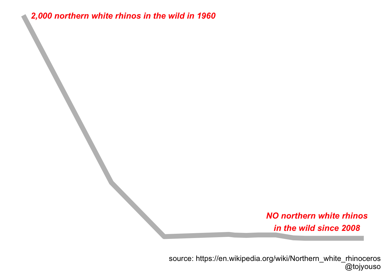
I think the minimalistic effect here is worth some loss of information. The important thing to show is that there were 2000 northern white rhinos in the wild in 1960 and now there are none.
The lives of rhinos in captivity
In the Wikipedia article, there was some more data that I thought was interesting. They had a few bullet points about the rhinos kept in captivity. The data was all in text so I had to manually extract the data points. With it I was able to produce this interesting chart of Sudan and his family and friends held in captivity.
rhino_deets %>%
  ggplot(aes(x = birth, y = names)) +
  geom_segment(aes(xend = death, yend = names), size = 2, colour = "grey") +
  theme(panel.grid = element_blank(),
        axis.text = element_blank(),
        plot.caption = element_text(),
        plot.title = element_text(face = "bold.italic")) +
  labs(x = NULL, y = NULL,
       title = NULL,
       caption = str_c("source: https://en.wikipedia.org/wiki/Northern_white_rhinoceros",
                       "\n",
                       "@tojyouso")) +
  geom_point(data = filter(rhino_deets, !names %in% c("Najin", "Fatu") ),
             aes(x = death), size = 3, colour = "red") +
  geom_label(aes(x = death + 5,
                 y = names,
                 label = str_c(names, " (", age, ")")),
             label.size  = 0, size = 3) +
  geom_label(data = rhino_deets %>% filter(names %in% c("Ben", "Fatu")),
             aes(x = birth - 3,
                 y = names,
                 label = birth),
             label.size  = 0, size = 3) +
  annotate("text",
           label = str_c("Lives of Northern White Rhinos in",
                         "\n",
                         "in Dvur Kralove Zoo and",
                         "\n",
                         "San Diego Zoo Safari Park"),
           x = 1960,
           y = 3,
           size = 3.5, fontface = 4)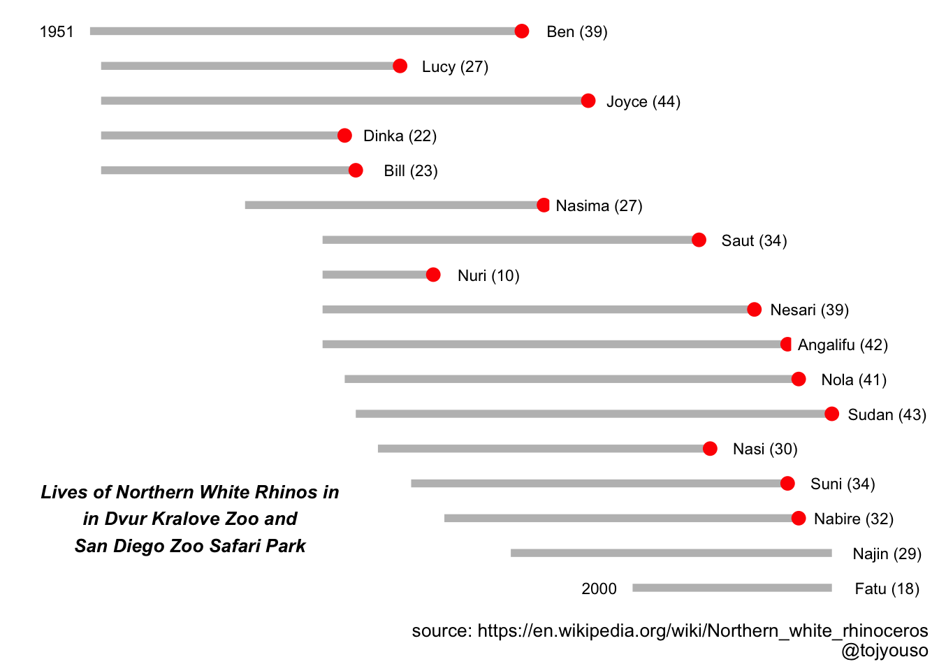
I really like this plot. Again, there are no axes just some careful labelling to bring out the important information: how the ages of the rhinos are distributed and when they’ve been born. It was nice to explore going without a title and using an annotation in the plot instead. I tried other themes, like with a black background but it didn’t look as good. You can find the code for that on github.
There are other things I wanted to add to the plot such as some colour to indicate whether they are male or female or which zoo/safari park they resided at but I’m still learning about how to customise ggplot2 legends so that will be for another time.
Anyway, as you can see there are only two northern white rhinos left and given the average age is 31 we might lose Najin soon.
Hope
But there’s hope! Since I started writing this post, another article by the guardian has come out - apparently they have been collecting rhino sperm for quite a few years and may be able to use it for IVF with other rhino subspecies. Neither Fatu nor Najin are able to carry offspring. If you want to donate to the cause, you can click here for more info.
I really enjoyed writing about rhinos
I really enjoyed writing this piece. I learnt a lot about rhinos and I learnt a lot more about R. Sometimes it can be hard to find topics/datasets for research or to write about because I’m looking for huge datasets to run machine learning algorithms on. Sometimes exploring the small data in unexpected data can be even more rewarding.