Plotting football pitches
I’ve recently been playing with some football data from Stratagem1 with locations of shots taken. And of course, the first thing I wanted to do was to plot it. This is different to my normal plots because I needed to give the plots context. So I learnt how to draw football pitches with ggplot2. On the way, I learnt about ggforce, a little about functional programming ggplot2 and a few other things. The following post documents a bit about the function and what I’ve learnt.
Goal
So this is what the final code and plot looks like:
plot_chances_football_pitch(
  ggplot() +
    # geom_point_football_pitch(data = chances, colour = "red", alpha = 0.3) +
    geom_hex_football_pitch(data = chances) +
    geom_football_pitch() +
    theme_football_pitch() +
    labs(title = "Probability of scoring by chance location",
       subtitle = str_c("The closer the chance is to the goal the higher the probability",
                        "\n",
                        "of scoring"),
         caption = str_c("as at 2018-04-11",
                         "\n",
                         "@tojyouso"),
       x = NULL, y = NULL)
)
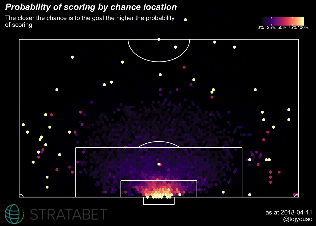
This is all chances (excluding penalties) in the highest division of the top 5 European football leagues. There were 79127 chances which doesn’t give a meaningful plot so I have summarised them into small hexagons where the lighter the hexagon the higher the proportion of goals scored from that hexagon. So if you ignore the sparse data and focus on where there is volume, it shows that location plays a huge part in the success of a chance.
I love how simple the code looks and how easy it is to change certain items to get a completely different looking plot:
plot_chances_football_pitch(
  ggplot() +
    # geom_point_football_pitch(data = chances, colour = "red", alpha = 0.3) +
    geom_hex_football_pitch(data = chances,
                            prop = F,
                            vir_dir = -1) +
    geom_football_pitch(line_colour = "black", background_colour = "white") +
    theme_football_pitch(line_colour = "black", background_colour = "white") +
    labs(x = NULL, y = NULL,
       title = "Open play shots from the top five European leagues",
       subtitle = "Most shots are taken within the 18 yard box",
       caption = str_c("as at 2018-04-11",
                         "\n",
                         "@tojyouso")),
  logo_colour = "white"
)
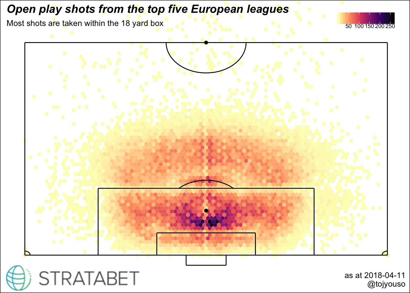
This plot shows the number of chances within each hexagon and the darker areas are areas where more chances are taken. Apart from a different theme, the plot is showing a count (look at the legend) instead of a proportion like the first one.
Not sure which one looks better but at least I can switch it up as I like.
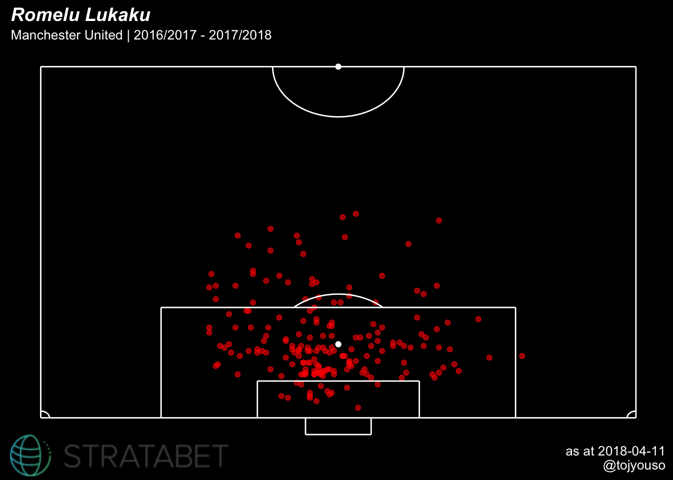
Final example: not only can the function handle hexagonal summaries, it can also plot individual chances. Here is a plot of Romelu Lukaku’s efforts on goal in the dataset:
plot_chances_football_pitch(
  ggplot() +
    geom_point_football_pitch(data = chances %>% filter(player == "R. Lukaku"),
                              colour = "red", alpha = 0.6) +
    geom_football_pitch() +
    theme_football_pitch() +
    labs(title = "Romelu Lukaku",
       subtitle = str_c("Manchester United | 2016/2017 - 2017/2018"),
         caption = str_c("as at 2018-04-11",
                         "\n",
                         "@tojyouso"),
       x = NULL, y = NULL))
Functional programming in ggplot2
The plot is made up of a few things as you can see from the code:
geom_hex_football_pitchgeom_point_football_pitchgeom_football_pitchtheme_football_pitch- Stratabet logo
Each of these things relies on function I created. The full code behind each function can be found here. I’ll probably be updating it over time so if it’s possible the code examples used in this post might break in the future!
When I was investigating how to write the code for the plots as a function I came across this stackoverflow answer which led me to this tutorial by Hadley Wickham on functional programming in ggplot2. The main discovery here was how one can specify a block of ggplot2 calls as a list and then insert that into a function. Whenever the function is called, the block of ggplot2 code is used.
I also finally learnt how ... works. I call it the pass through. It allows you to specify a lower level function argument in a higher level function call. I think that makes sense. It’s best with an example, so here’s the code for the geom_hex_football_pitch:
# group individual chances into hexagons based on count or other proportional metric
geom_hex_football_pitch <- function(prop = T,
                              hex_num = 100,
                              x_loc = "chance_x",
                              y_loc = "chance_y",
                              metric = "goal",
                              vir_dir = 1,
                              ...) {
  if (prop) {

    # list of ggplot2 code
    list(
      stat_summary_hex(bins = hex_num, aes_string(y = y_loc, x = x_loc, z = metric), ...),
      scale_fill_viridis_c(option = "A", label = scales::percent, direction = vir_dir)
    )
  } else {

    # another list of ggplot2 code
    list(
      stat_bin_hex(bins = hex_num, aes_string(y = y_loc, x = x_loc), ...),
      scale_fill_viridis_c(option = "A", label = scales::comma, direction = vir_dir)
    )
  }
}
Because I’ve specified the pass through as a function argument and also in the stat_summary_hex, I can use any of the arguments in stat_summary_hex when I call geom_hex_football_pitch. That’s what I did in the earlier plots when I used the data argument:
geom_hex_football_pitch(data = chances) The geom_point_football_pitch works in a very similar way. I was able to use quite a arguments from the geom_point that that function is wrapped around:
geom_point_football_pitch(data = chances %>% filter(player == "R. Lukaku"),
                              colour = "red", alpha = 0.6)
Drawing the pitch
The pitch plot is quite simple. It’s made up of straight lines and a couple of curved lines.
The straight lines were the easiest part - just a simple geom_segment which only needs a start coordinate, an end coordinate and a colour.
geom_segment(aes(x = 15, xend = 15, y = -10, yend = 0), colour = line_colour) The circles were a bit more difficult. Actually I cheated here a little, they are ellipses but I think they look good enough for what I’m doing. I used yet another package from Thomas Pedersen and the function ggforce::geom_arc. I needed to specify a radius and then how much of the ellipse I wanted. For example, for a complete ellipse, I needed to specify a start and end that spanned 2 * pi. Here’s what the code looks like for the corner flag on the right:
ggforce::geom_arc(aes(x0 = 136, y0 = 0, start = 1.5 * pi, end = 2 * pi, r = 4), colour = line_colour)Adding a logo
Since the data is kindly provided from Stratagem, I should also include their logo in the plot. What I used to do was save the plot and then paste the logo onto the .png file with another program. But I wanted to investigate how to do this withR so I can avoid the manual process.
This was not as easy as I thought, I tried quite a few methods before I settled on the final approach. It was great though as I discovered an amazing R package called magick2. It’s a package that allows for easy manipulation of images with R. There’s a lot you can do like combining plots, rotating plots, creating animations and it uses the pipe.
I didn’t end up using magick for adding the logo for a couple of reasons:
It doesn’t work well with
ggplot2objects. Or rather I couldn’t figure out how to use it properly. So I had to save theggplot2plots to a png file and then import them again usingmagick. It just didn’t feel like a slick solutionI had trouble with printing
magickfiles. They rendered OK when I knitted anrmarkdownfile but not when I was using Rstudio notebooks. It didn’t render in-line which was problematic for me since I use those pretty much all the time I’m inR. Again I had to save as png and then import which I didn’t enjoy!
However I did use it for getting the logo in the format I wanted.
It’s magick!
The logo from Stratagem looks like this in its raw form:
logo <- magick::image_read("/Users/mobolayo/Documents/R/stratagem/plots/stratagem.png")

logo
But to get the logo in the right format for the plot, I had to crop it and add a black background so it goes with the dark theme.
logo <- logo %>%
  # crop logo
    magick::image_scale("200") %>%
  # add black background to the logo
    magick::image_background("black", flatten = T)

logo
Now the logo was ready to be combined with the original pitch plot.
Adding the logo to the plot
In the end, I went for a simple solution of using annotation_custom. But I had issues with ggplot2 clipping so continued searching for an answer before stumbling on yet another stackoverflow answer. Using the grid package, I was able to go into the ggplot2 object and turn off clipping which allowed me to place the logo in the bottom left corner. Nice and flush.
So here’s the code for the plot without adjusting the clipping:
# convert logo to format used by `grid`
logo <- grid::rasterGrob(logo, interpolate = TRUE)

pitch_plot <- ggplot() +
    # geom_point_football_pitch(data = chances, colour = "red", alpha = 0.3) +
    geom_hex_football_pitch(data = chances) +
    geom_football_pitch() +
    theme_football_pitch() +
    labs(title = "Probability of scoring by chance location",
       subtitle = str_c("The closer the chance is to the goal the higher the probability",
                        "\n",
                        "of scoring"),
         caption = str_c("as at 2018-04-11",
                         "\n",
                         "@tojyouso"),
       x = NULL, y = NULL) +
  # add the logo by specifying the xy coords
  annotation_custom(grob = logo, xmin = -150, xmax = -50, ymin = -45, ymax = 0)

pitch_plot
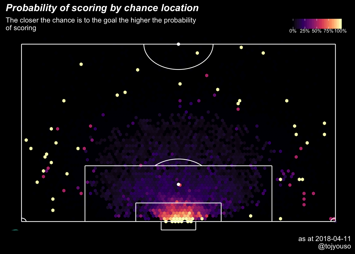
You can’t see the logo because it’s off the plot and ggplot2 by default does not plot it if it not contained within the plot box. Or it will clip it and only keep the part that is within the plot box. By plot box, I mean where the actual data lies excluding the titles, subtitles, captions etc.
The following code fixes that:
# turn off clipping
gg2 <- ggplot_gtable(ggplot_build(pitch_plot))
gg2$layout$clip[gg2$layout$name == "panel"] <- "off"


# draw new page
grid::grid.newpage()

# draw plot without clipping
grid::grid.draw(gg2)
NB: I had to add grid.newpage() because grid.draw does not produce any plots without it when I’m in an Rstudio notebook. So it’s a small workaround for now.
Conclusion and next steps
So that’s it. I finally finished the code to create the plots that I’m satisfied with. Like I mentioned earlier, I’ll be updating this over the next few months as I explore the data further. There are quite a few other plots I’d like to do with the data so maybe this will give me a chance to try out creating a package.
Anyway, all the code for the function is here
This article was written with the aid of StrataData, which is property of Stratagem Technologies. StrataData powers the StrataBet Sports Trading Platform, in addition to StrataBet Premium Recommendations.↩